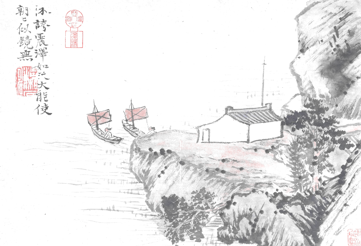
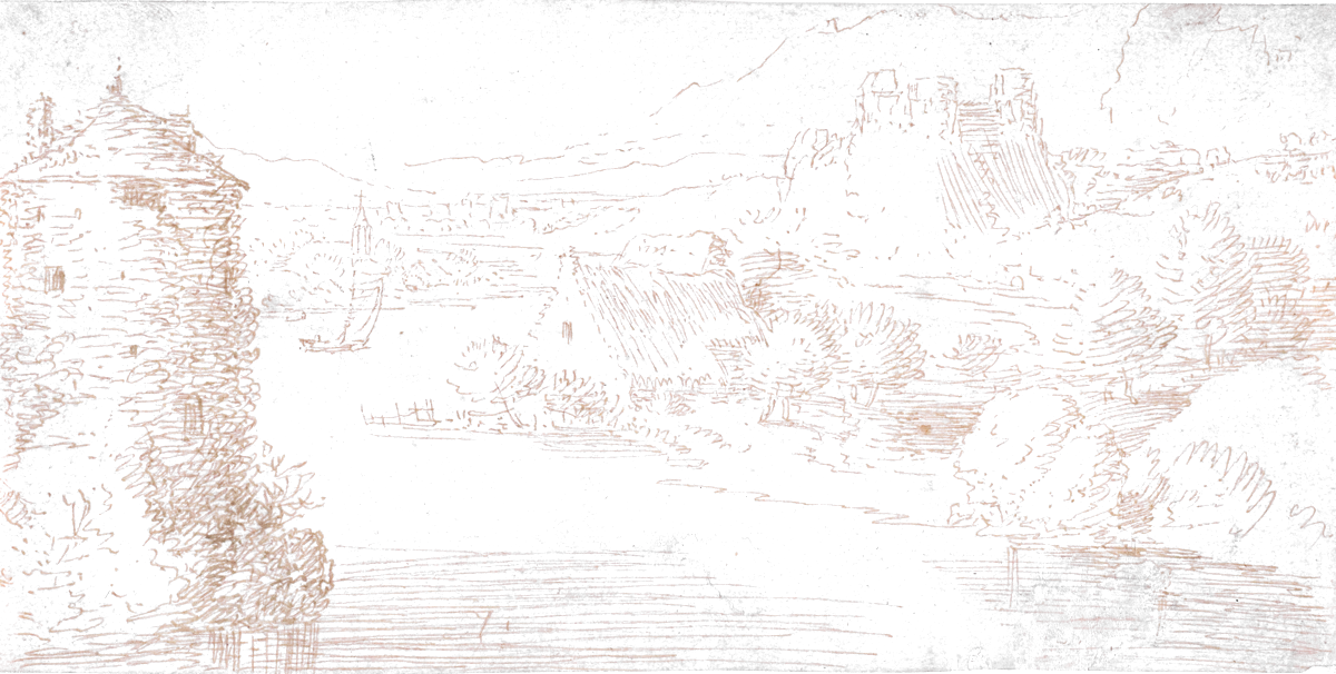
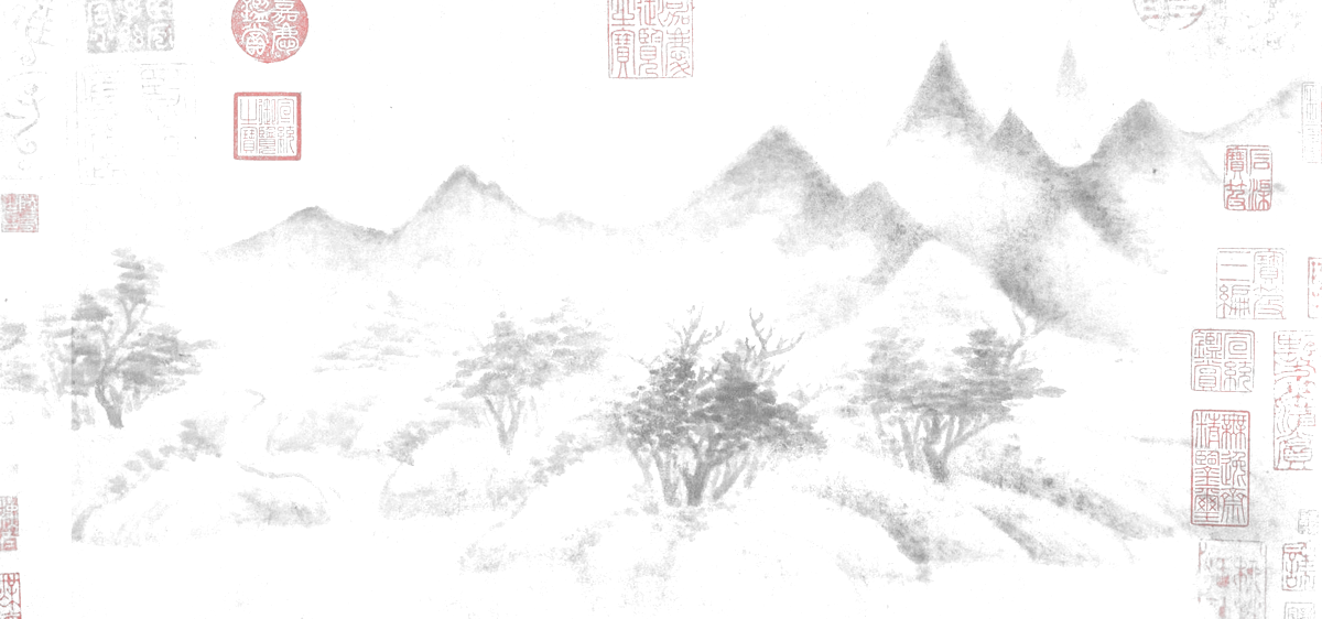
Seeing a drawing inside out
Seven old drawings lifted off their paper, then turned over. What the paper/ink switch reveals in a sixteenth-century sheet, and what it distorts: because a tool that reveals also distorts.
This site has two surfaces, paper and ink, and a sign that is a switch. Until now the flip was only a reading comfort. Putting old drawings on the pages turned it into something else: an instrument. Turning over a sixteenth-century sheet brings out what ordinary reading did not show: a little like an X-ray, except that nothing here is added.
A drawing is ink laid on paper. Flat-field the lighting of the photograph and you can read the sheet as ink composited over white, then invert that compositing: alpha becomes the distance from white, colour becomes the ink underneath. The ground disappears and the page tone passes through the drawing. The image no longer sits on the page: it belongs to it.
// alpha = distance from white; the colour is the ink under the white
const alpha = 1 - Math.min(r, g, b) / 255;
if (alpha < threshold) return TRANSPARENT;        // bare paper
const ink = [r, g, b].map((v) => (v - 255 * (1 - alpha)) / alpha);

// Composited over any surface, the result reproduces the original.
// That is what makes mix-blend-mode unnecessary.
The consequence is that one image holds on both surfaces. On ink, a colour matrix gives the ink back to the paper: a dense stroke returns dense and a faint one stays faint, since alpha is exactly the ink density. A woodcut turns over into silver on black.
Writing this pipeline by hand would have taken days. It was built in dialogue: I describe what looks wrong, the assistant proposes a treatment, we measure it, we start again. Nothing about the keying is automatic: it took five passes, and each came from a fault seen on screen rather than from an intention set out in advance.
- A single key is not enough: the photograph carries a lighting gradient, and on the first sheet the silk sat anywhere between 0.02 and 0.20 from white depending on where you looked. The sheet had to be flat-fielded before it could be read.
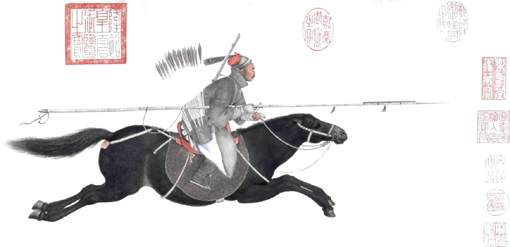
- A scroll’s mounting bands sit as far from white as the shaded silk. No threshold separates them; they have to be located first, then held out of the calculation.
- The first spot sweep protected any blob touching the edge of its band, on the reasoning that it continued into the drawing. For the top band that edge is the edge of the sheet, so every spot there survived. A one-line bug, invisible without looking at the result.
The division of labour is the point: the machine holds the arithmetic (percentiles, connected components, colour matrices) and the eye decides. None of the five corrections would have been found by measurement alone, because none of them shows up in the numbers. They show up on the page.
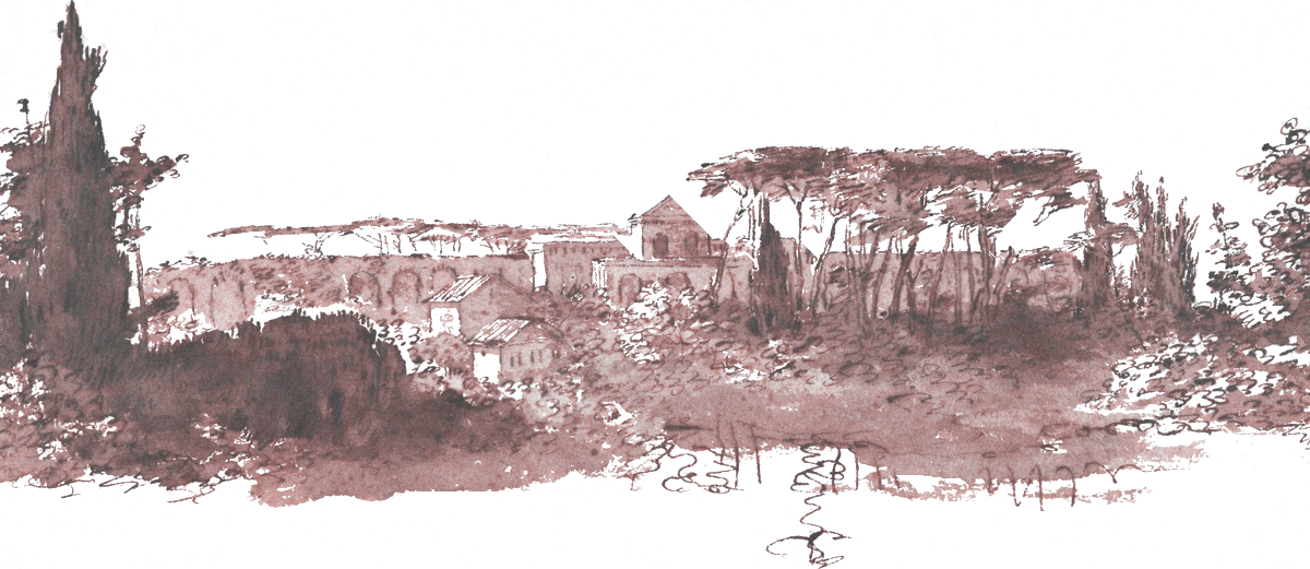
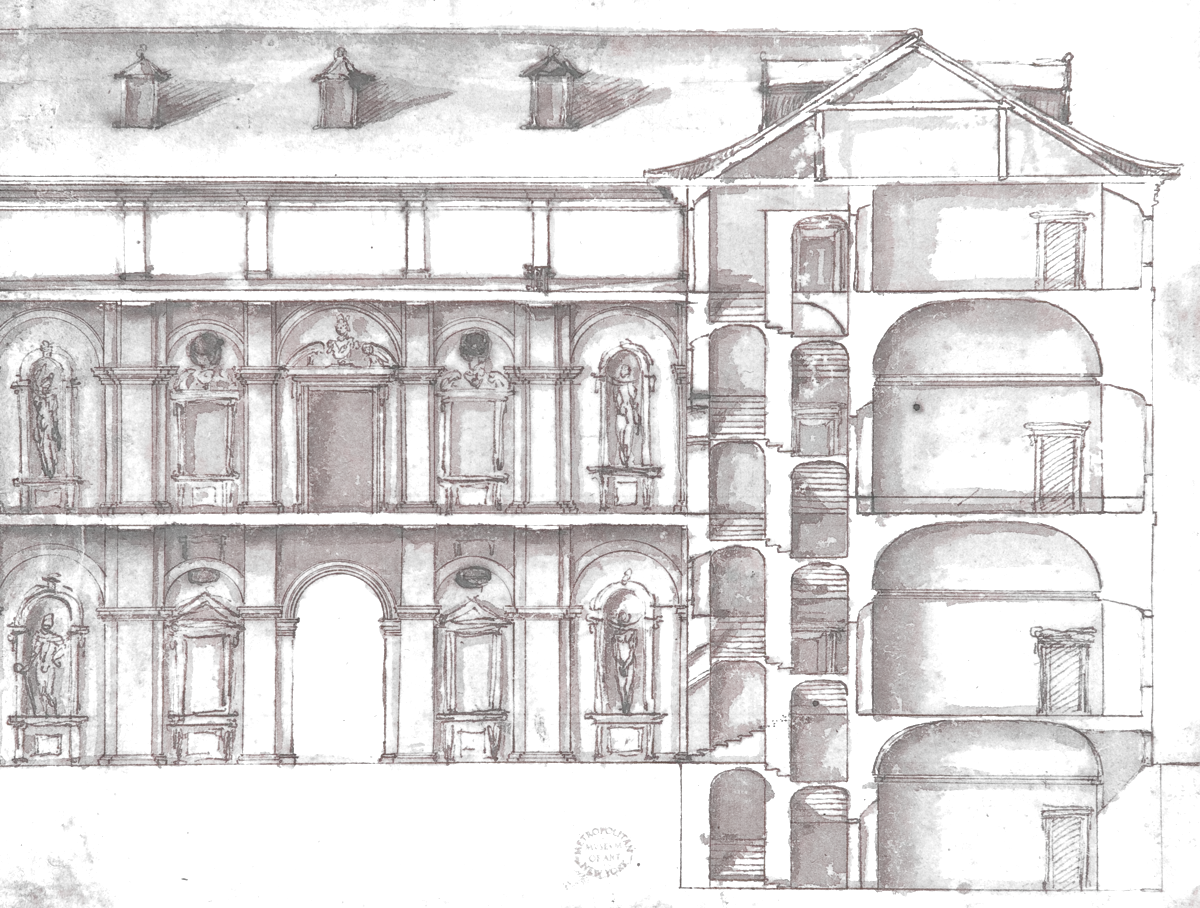
- On Lorenz Stöer’s 1567 woodcut, the negative finally separates the solids from the ruins: what read as a tangle of hatching becomes a legible mesh, four centuries before the wireframe.
- On Seurat’s conté, where there is no contour at all, the inversion shows the form is made only of densities: the lighthouse exists only because the grain thins out around it.
- On Claude Lorrain’s wash, the keying first brought out the foxing of the paper, invisible to the eye and impossible to tell from a light wash by any threshold. Shape separates them: a spot is an island, a mark belongs to a mass.

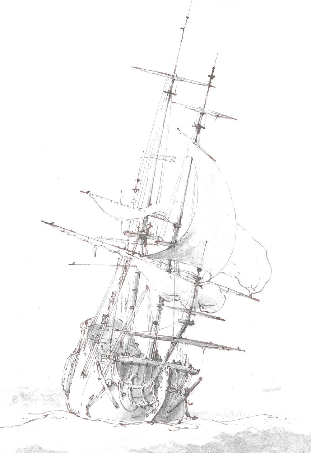
Un-compositing divides colour by alpha, so a light stroke comes out more saturated than it is on the sheet. On Backhuysen’s ship, the red lines you notice are the drawing’s brown ink, an oxidised iron-gall ink, exaggerated by the treatment. The museum records the underdrawing as black chalk: these are not preparatory lines, as one might assume. And deciding that a spot is not part of the drawing is already an interpretation. The code that decides it runs to forty lines and its rule is arguable, which is the subject, rather than a flaw in it.
The graphic thinking (tokens, surfaces, the sign as a switch) was done in Claude Design, then the implementation and all the image work in Claude Code. The two stages are distinct: the first sets rules, the second applies and tests them, which revokes a few of them.
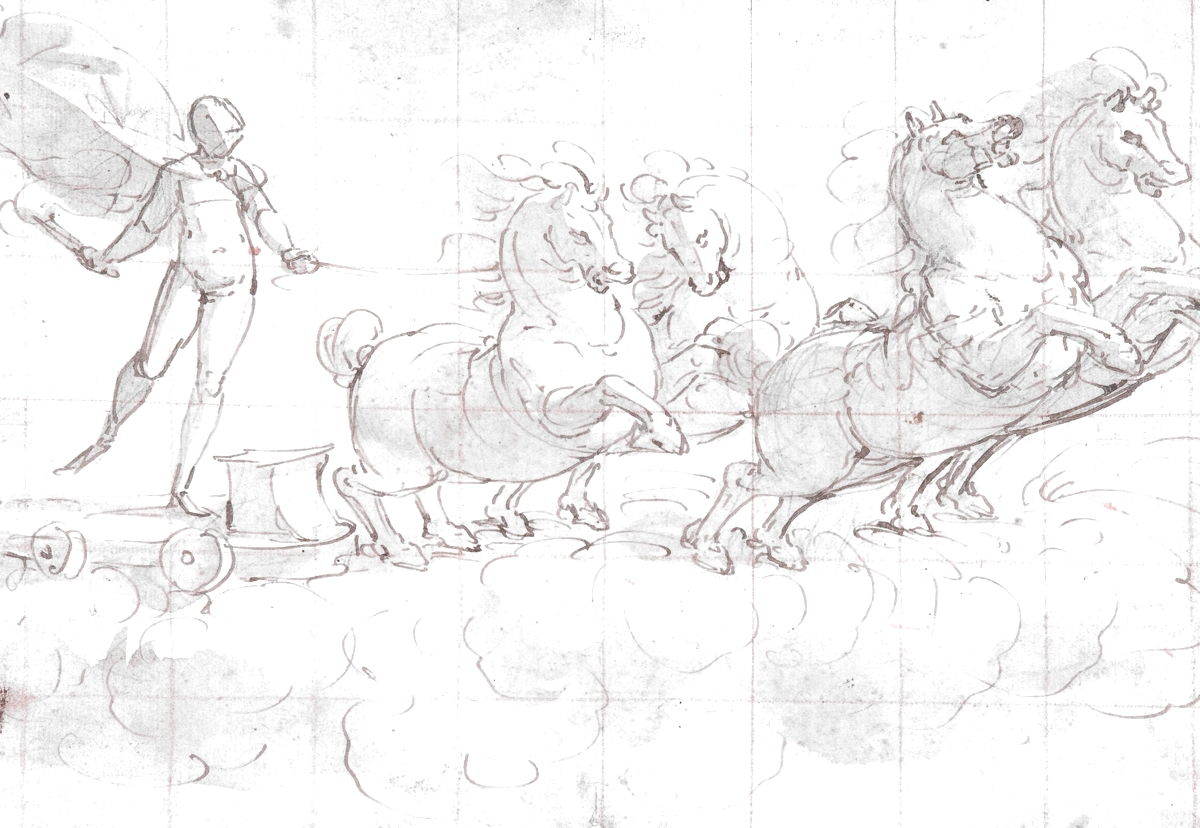
The least predictable part was the research. Finding, in museums’ open archives, a plate that carries a page’s argument means knowing what you are looking for: that an album is an inventory, that a mezzotint is made by removing black, that the squaring grid on a Cambiaso drawing is a construction left on show. Without that grounding you query an API with keywords and get back what everyone gets back. The sorting stayed manual: two proposals that were sound on paper (a sheet of screaming grotesques, a sheet of nudes) were dropped simply by looking at them.
Two conditions governed everything else: that the author is out of copyright, and that the institution itself publishes its reproduction freely. The age of the subject is not enough, a 1960s drawing of an 1880 liner is still protected, and seeing a work in a museum does not license reproducing it.
What follows hands you the switch. The seven sheets are grouped by theme and walked with the keyboard: up and down for the two positions, left and right for the plates. It is the same gesture as the sign at the top of the page, except that it no longer sets a preference: it is there to see with. The keyboard as a brush: four keys, and the sheet gives itself up differently.
Twelve sheets, four themes, one switch. Up and down change the surface, left and right change the plate. By keyboard, by finger, or with the buttons.